Project for Halmstad University – Insidan Support Pages
Our client, responsible for research support at HH.se, tasked us with redesigning the support pages for the multi-stage research application process. We began by interviewing researchers to understand their experience with Insidan’s support pages. A key insight emerged: most researchers preferred asking colleagues for help because the support pages were confusing and difficult to navigate. The information was crammed into a single, overwhelming page—essentially a massive text file. Recognising the need for a more structured and user-friendly approach, we explored different layout designs and gathered feedback via surveys from researchers. Additionally, we conducted a heuristic evaluation by walking through the application process to identify usability issues. Based on the findings, we developed a new structure where each step of the application process was clearly outlined in collapsible sections. We also introduced a simplified step-by-step navigation bar to help researchers easily track their progress and find relevant information without getting lost. Finally, we rewrote and reformatted the content to ensure clarity and readability. The result: a streamlined, intuitive support page that makes the research application process easier to understand and navigate.
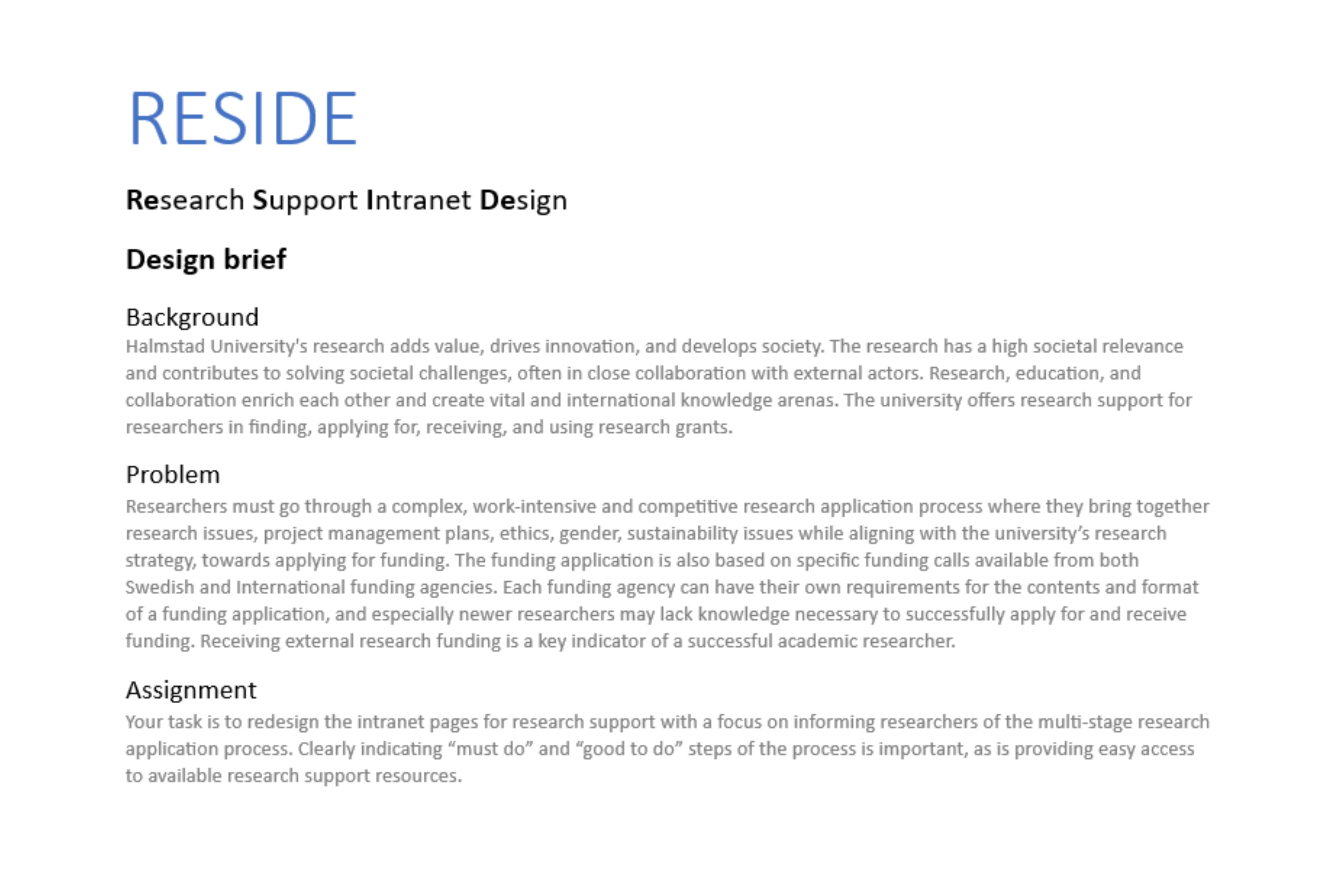
The Project Brief:
The First Steps: Research-Driven Redesign
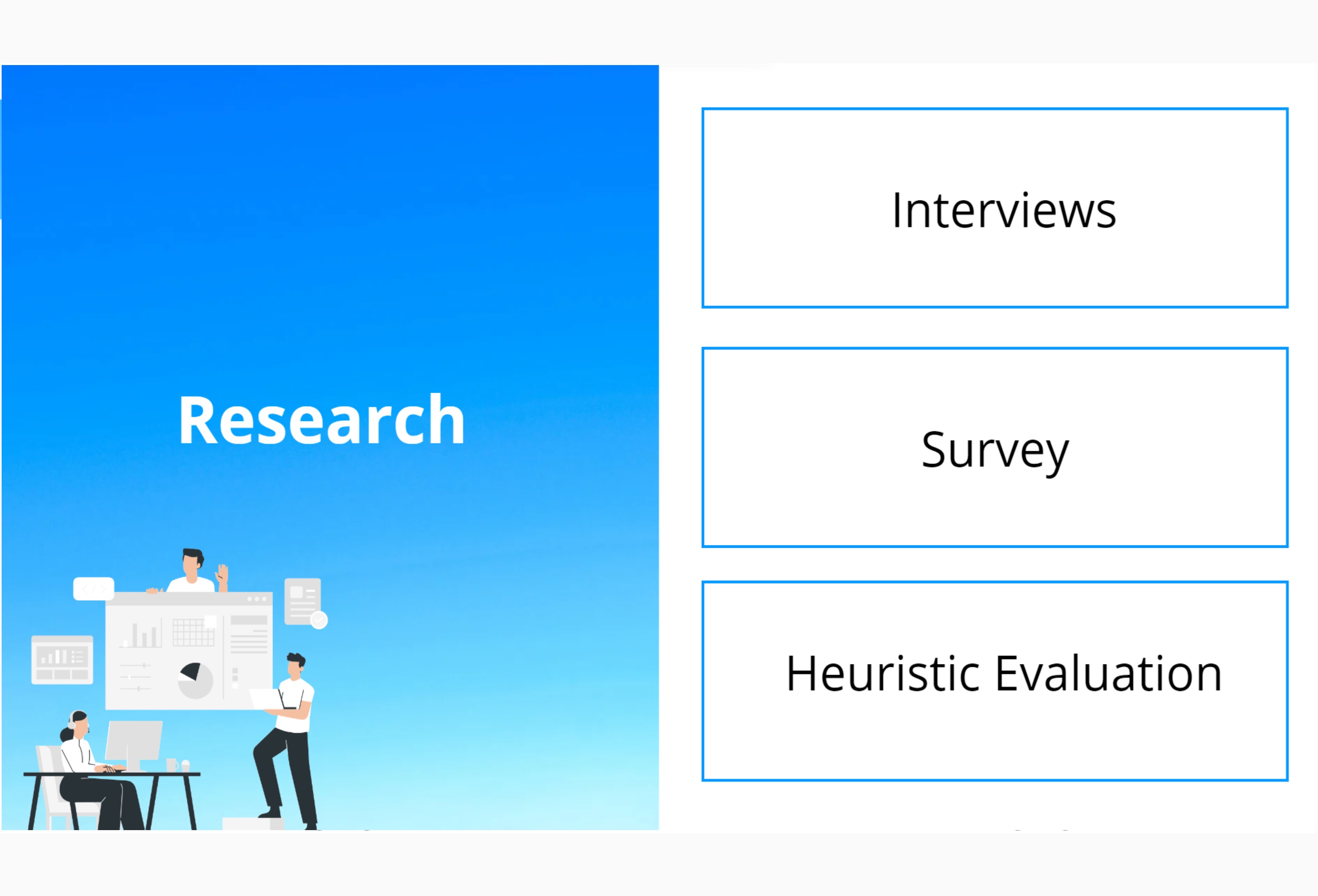
Every great design process starts with research! To ensure our redesign effectively addressed user pain points, we conducted interviews and a survey with previous research applicants. These methods helped us gain a deeper understanding of their experiences and challenges with Insidan’s support pages. As part of our research, we also performed a heuristic evaluation, carefully walking through the existing multi-stage application process to identify usability issues. By combining user feedback with expert evaluation, we pinpointed the main friction points research applicants faced—primarily, the overwhelming amount of information presented in a single, dense text file. These insights guided our next steps, ensuring that our redesign would directly address users’ needs and improve navigation, clarity, and overall usability.
Key Issues Identified Through Research
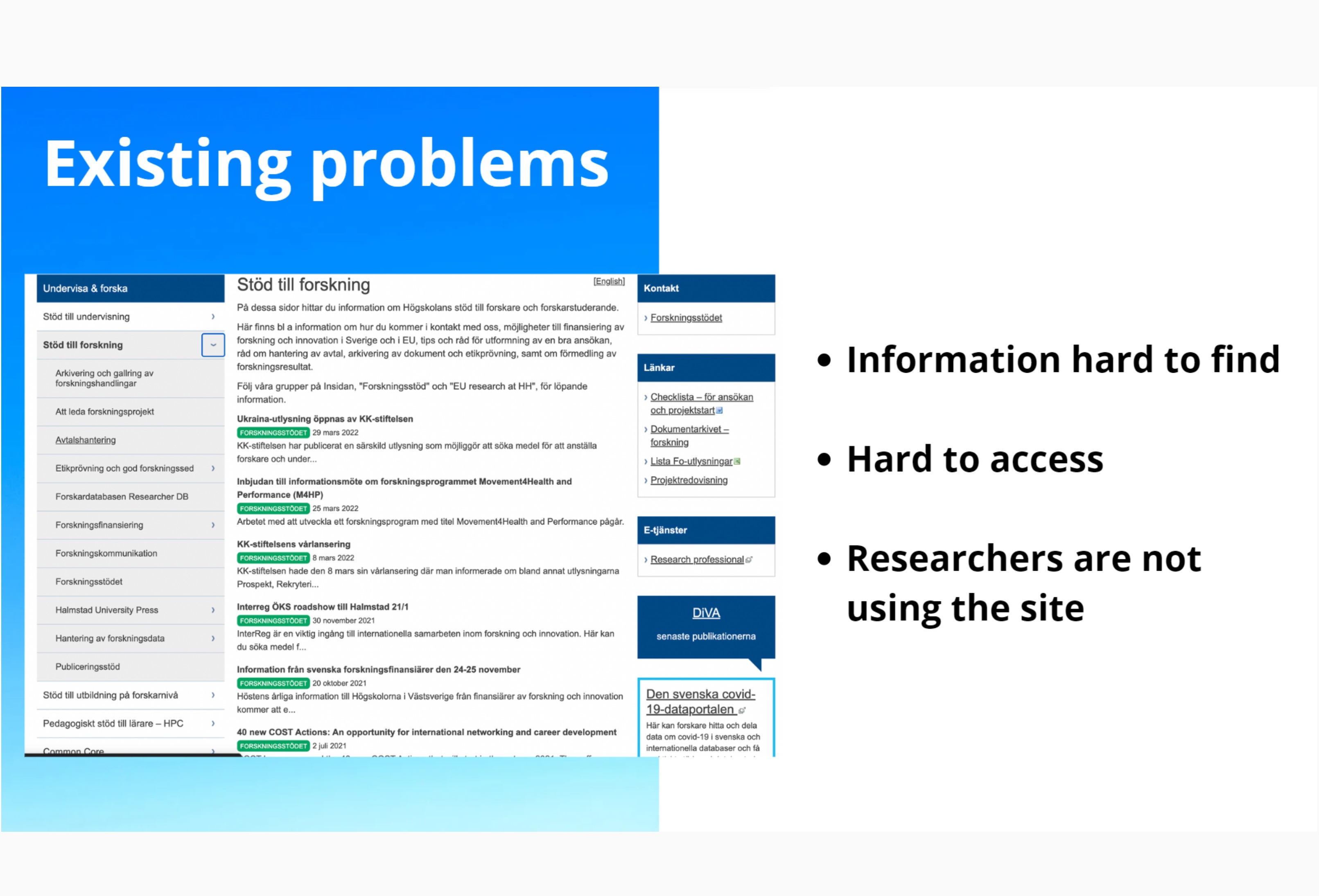
Our research uncovered several major pain points that hindered the usability of Insidan’s support pages:
• Information was difficult to find – Researchers struggled to locate the specific details they needed within the overwhelming amount of text.
• Limited accessibility – The existing structure made it hard to navigate, leading to frustration and inefficiency.
• Low engagement – Instead of using the support pages, researchers preferred asking colleagues for help, indicating that the pages were not serving their intended purpose.
These findings highlighted the urgent need for a clearer, more structured, and user-friendly design to ensure researchers could easily access the support they needed.
Design Implementation: The Application Process NavBar
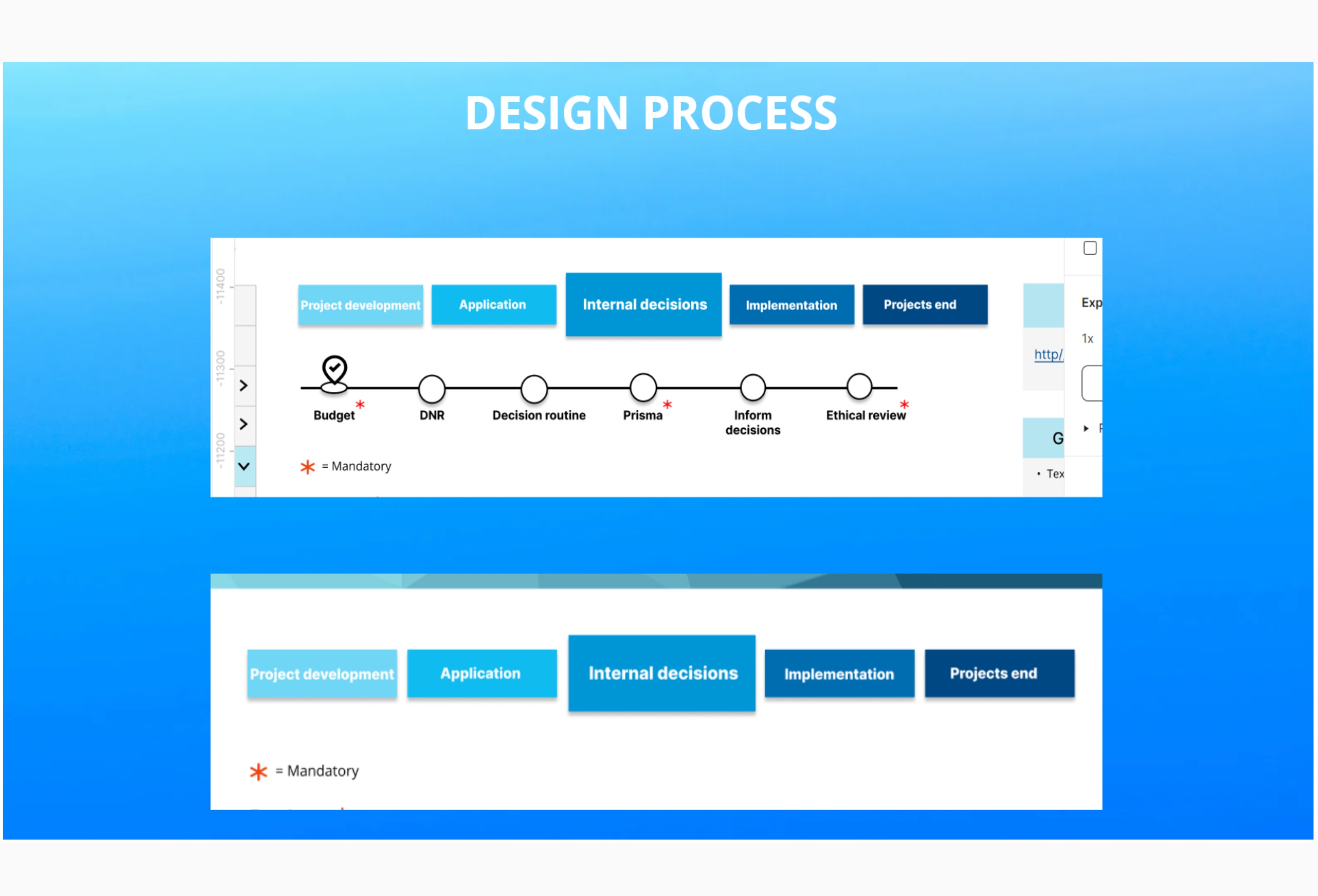
As part of the design process, we introduced the Application Process NavBar, a key feature designed to visually guide applicants through each step of the research application process.
This navigation bar was carefully structured to:
• Provide clear step-by-step guidance – Ensuring researchers always knew where they were in the process.
• Improve usability – Offering an intuitive way to access relevant sections without overwhelming users.
• Enhance accessibility – Allowing applicants to quickly find the information they need without scrolling through long text blocks.
By integrating this feature, we transformed the support pages from a confusing text-heavy layout into a streamlined, user-friendly experience that made the application process easier, clearer, and more efficient.
Layout & Design of the Application Process NavBar
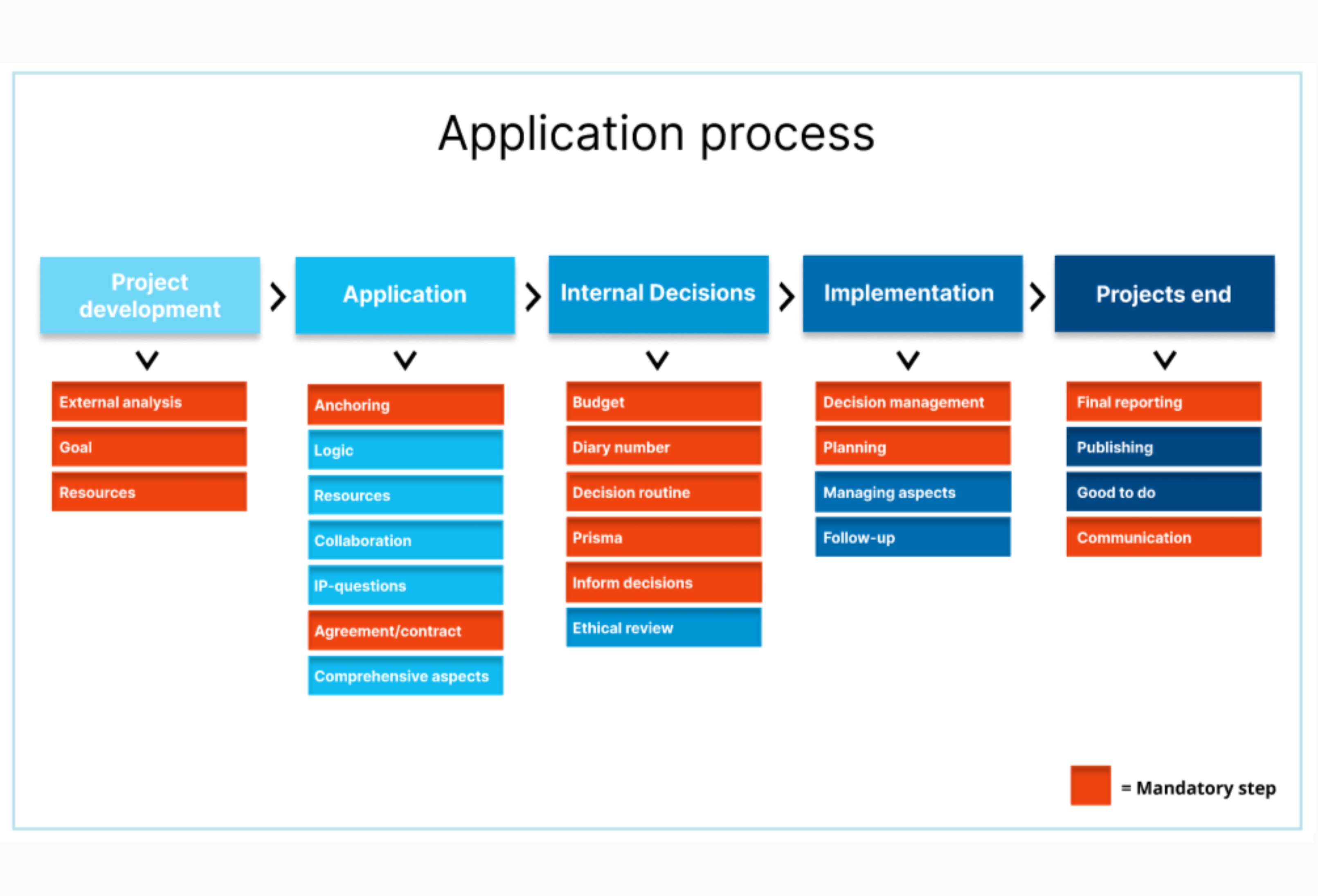
The newly designed Application Process NavBar was created to provide a structured, user-friendly experience for researchers navigating the multi-stage application process.
Key Design Features:
• Step-by-step navigation – Each phase of the application process is clearly defined, allowing users to track their progress easily.
• Collapsible sections – Clicking on a step reveals relevant subcategories, reducing visual clutter and making information more accessible.
• Intuitive design – A clean, organised layout ensures that researchers can find what they need quickly, without unnecessary scrolling.
• Consistency & clarity – The NavBar maintains a logical flow, ensuring all necessary support is available at the right moment.
By implementing this improved layout, we transformed a previously overwhelming text-heavy page into an efficient, easy-to-use system that enhances usability and supports researchers throughout their application journey:
Before & After: Transforming the Support Pages
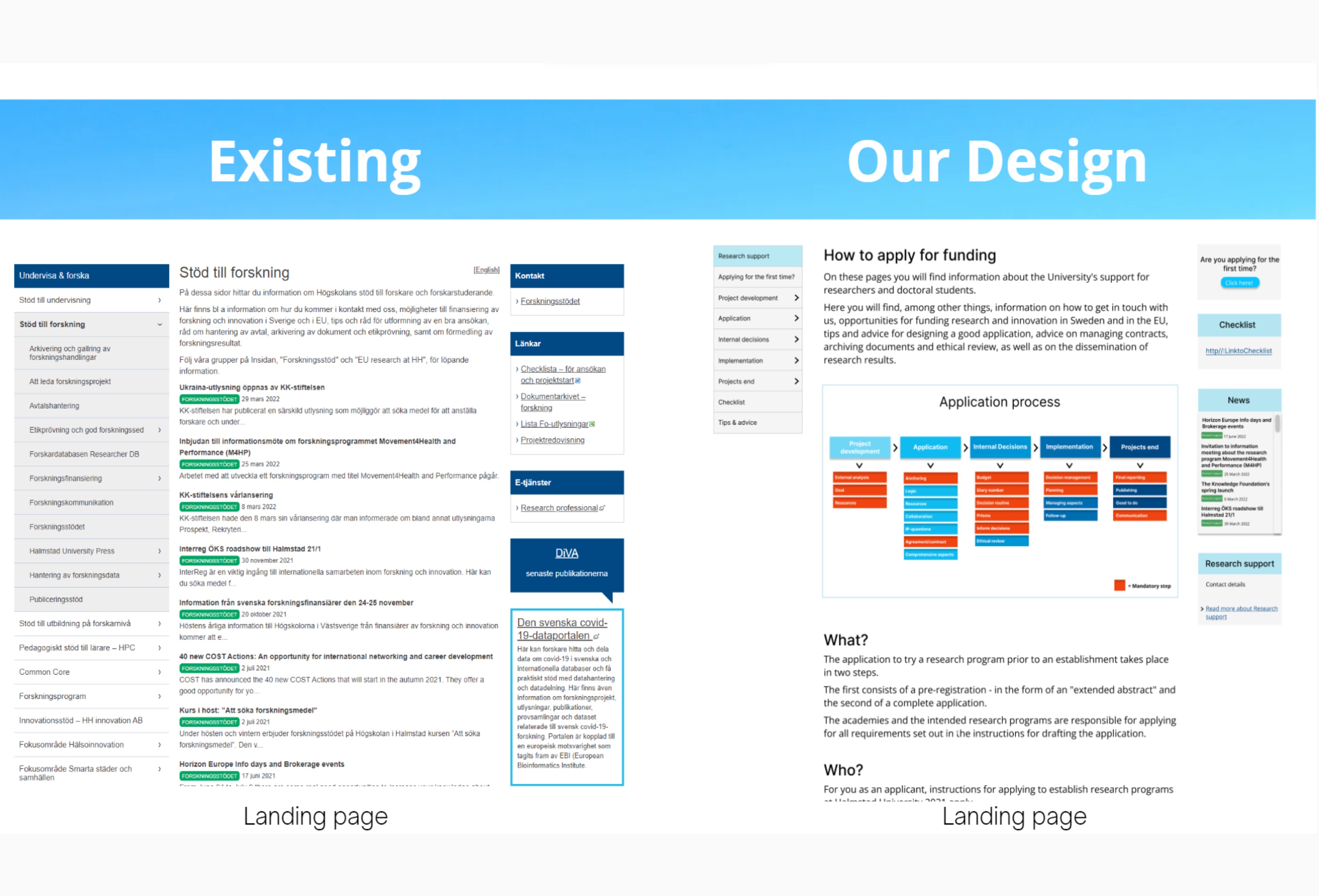
Our redesign focused on improving usability, structure, and accessibility to ensure researchers could easily find and navigate the information they need.
🔴 Before (Existing Design):
The page was cluttered with long, unstructured text, making it difficult to scan and locate specific information.
The side navigation menu was overwhelming, with too many links and no clear hierarchy.
Researchers had to scroll extensively to find relevant details, leading many to seek help from colleagues instead of using the support pages.
The application process lacked a visual guide, making it hard to understand the steps involved.
🟢 After (Our New Design):
We introduced a clear, structured layout, with well-defined sections and headers.
The new step-by-step NavBar visually guides researchers through each stage of the application process.
Collapsible sections were added to reduce information overload and improve readability.
Important details, such as checklists, contact information, and news updates, are now easily accessible in dedicated sections.
The application process is now visualised using a clear diagram, improving comprehension and reducing confusion.
The Result:
A modern, user-friendly interface that streamlines the research application process, making it easier, faster, and more intuitive for researchers to find the support they need.
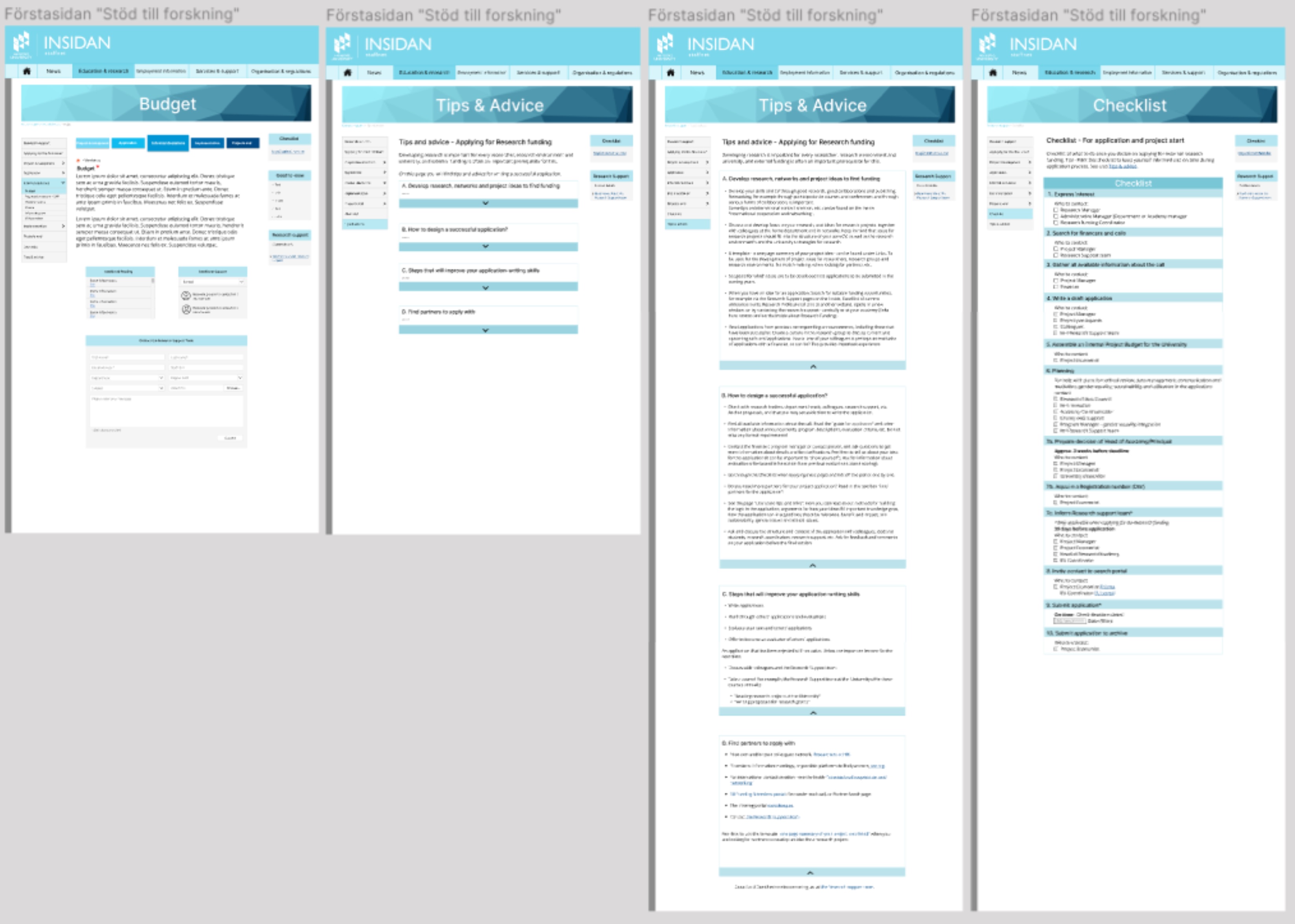
Final submission - Figma
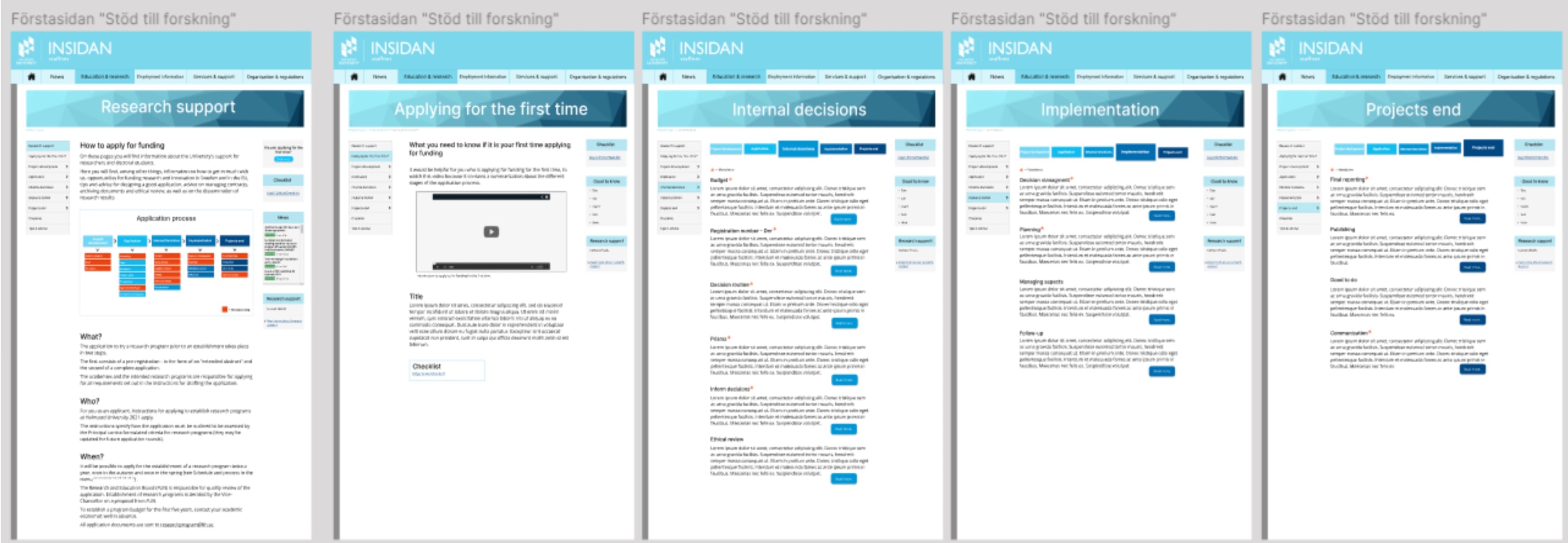
As part of the final submission, we expanded the support pages significantly, ensuring a more comprehensive and structured resource for researchers. Several new pages were added to address key pain points, making the application process clearer and more user-friendly.
One of the most critical additions was the Final Checklist, a dedicated page that allows applicants to verify they have completed all necessary steps before submitting their application. This checklist is essential because:
• Missing steps can lead to funding rejection, forcing applicants to wait until the next application cycle to reapply.
• It ensures clarity, helping researchers systematically track their progress and avoid common mistakes.
• It streamlines the process, reducing the chances of incomplete applications and unnecessary delays.
With this final iteration, the research support pages have evolved into a fully structured, step-by-step guide, ensuring applicants have all the tools they need for a smooth and successful application process.
 Check out my other projects below!


